With all the recent talk about mortgage rates “hitting new all time historical lows” and rates remaining near “all time historical lows”, it can be difficult to appreciate exactly how low mortgage rates have come. This is especially true in the historical context of mortgage rates, which spans many years. For this reason, sometimes charts can do what words cannot; give perspective of where mortgage rates are relative to where they have been historically.
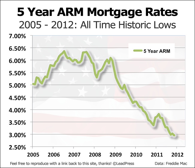
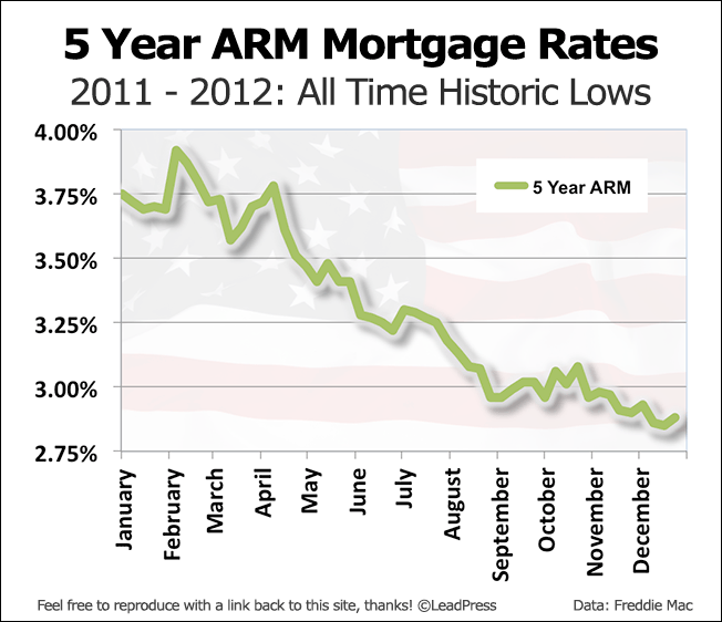
Today we present to your a history of 5 Year ARM mortgage rates. The following charts chronicle the 5 Year ARM (Adjustable Rate Mortgage) from 2005 and from 2011 to the present.
5 Year ARM (Adjustable Rate Mortgage) Mortgage Rates Since 2005
5 Year ARM (Adjustable Rate Mortgage) Mortgage Rates: 2011 – 2012
Perspective on Mortgage Rates in 2012
These charts paint a dramatic picture of exactly how high mortgage rates have been in the past and how low they are now. Need help locking a rate? Not sure which program is the best for your needs? We can put together a mortgage strategy that suits your unique needs and help educate you on the loan programs that best fit your needs.
Are You a Mortgage Broker or Real Estate Agent?
If so, we highly encourage you to share these charts on your website or blog. We simply ask that you also post a link back to this site. To download, click on each chart > right click > save to desktop > upload to your site.


About The Author: Karengustin
More posts by karengustin